dory.live
FULL STACK · ANALYTICS ENGINEER

Every product team has a dashboards problem — not a data problem. There are too many of them, full of numbers nobody acts on, and the usual response to a Monday traffic drop is 'hm, weird' followed by a Slack thread that resolves itself by Friday. Mixpanel, Amplitude and GA4 solved 'can I see what happened?' — they never solved 'why did it happen?' or 'what should I do about it?'. Dory's tagline, agentic intelligence for modern teams, is the actual design brief: get from raw behavioral data to an action with no analyst in the loop.
The primary user is a PM or founder-engineer responsible for growth, retention and shipping — not a data analyst, context-switching every 45 minutes, opening the dashboard because a bad metric hit a Slack channel. They want an answer, not a dashboard; they have zero tolerance for friction; they've learned to distrust anomaly banners that cried wolf; and they carry status anxiety about not noticing the drop a client will ask about. Every decision runs through that model — the anomaly banner shows up unsolicited, and the RCA returns one English sentence in 5–15 seconds.
Dory runs entirely in dark mode on #0b0b0f — a near-black with a faint blue tint so the primary blue feels at home rather than slapped on. The whole system is built in OKLCH, a perceptually uniform space, so oklch(0.65 0.15 240) blue reads at the same lightness as a red-orange destructive alert — nothing feels jarring when switching between them, which HSL can't guarantee. Chart colors run sky-blue through indigo to form a natural reading hierarchy where the eye lands on the largest segment first.
A single font — Noto Sans — loaded from 400 to 900, with the black weight used aggressively because thin type disappears on dark backgrounds. Sizing is polarized: tiny uppercase labels (10px, 0.3em tracking) or enormous numbers (text-9xl). The realtime active-visitor count renders at text-9xl because it's the only number that matters on that screen. Cards use a 1px border at 5% white — barely visible but enough to define each surface — and blurred glow divs act as a zero-cost light source that makes the UI feel three-dimensional.
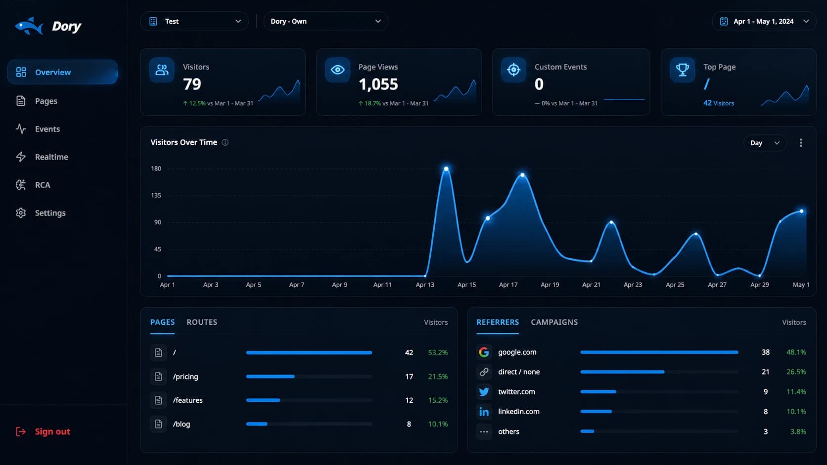
The marketing page is a scrollable pitch — hero, product preview, core value, feature cards, live API sample, testimonial, integrations, CTA. The hero runs a custom WebGL prism built on OGL that refracts simulated light into slowly shifting blue-cyan gradients; suspendWhenOffscreen pauses the render loop via IntersectionObserver, and a 0.3 timeScale makes it feel geological rather than frantic. Anime.js v4 onScroll reveals everything from below with outExpo easing and staggered grid items, scoped and reverted cleanly on unmount.
Persistence splits between MongoDB (document store, primary of record) and ClickHouse (columnar OLAP). Every pageview writes to MongoDB first, then mirrors to ClickHouse in a non-fatal try/catch — if ClickHouse is down the hit is still recorded and the data is never lost. Dashboard overviews and five-dimension RCA slicing that would crawl in Mongo run in milliseconds as a single columnar scan. For RCA, raw events roll up into precomputed HourlyStat buckets at trigger time, so detection stays fast no matter how many raw events exist.
Root Cause Analysis is the differentiating feature, run as a synchronous POST (serverless kills background work after the response). Phase 0 is a data-quality gate — a site with 3 daily pageviews 'detecting' a 40% drop is noise, so it fails fast. Phase 1 detects the anomaly against a dynamic threshold that scales with volume (5% matters for large sites, 40% for tiny ones), then slices country, device, referrer, UTM source and page route simultaneously, ranking segments by fractional contribution with an elbow cap before findings become noise.
Phase 2 asks when it started: a Z-score change-point detector scans the hourly series for the inflection ('change point at 14:00 Dec 12, Z=3.4'), builds before/during/after segments and computes lag correlations to tell a root cause from a consequence. Phase 3 applies a causal framework — earliest onset, highest contribution, most correlated propagation — producing an ordered causalChain with root nodes flagged, then a ClickHouse hotspot scan finds the exact intersection ('Mobile + Direct', 'US + Chrome') that drove the drop.
Phase 4 moves from explaining to prescribing: it maps a root cause to recommended actions with expected impact and runs a recovery simulation of the traffic curve if those actions execute — then fires a structured payload to the site's rcaWebhookUrl, powering a Slack bot, a feature-flag kill switch or a PagerDuty de-escalation. Phase 5's explainer collapses the whole payload into one paragraph under the AI Summary label: 'A 31% drop began at 2pm Dec 12; Mobile Direct traffic drove 68%; a sharp onset (Z=3.4) suggests a deployment, not organic decay' — replacing a 45-minute analyst deep dive.
The realtime page polls every 5 seconds — a deliberate choice over WebSockets — computing active visitors as unique IPs in the last 5 minutes, the hero number gradient-fading from white so an enormous count feels elegant. Access is multi-org and multi-site with OWNER/ADMIN/MEMBER roles; the dashboard server component filters sites by the user's membership scope so the shape of the data itself enforces access — no client-side permission check. Invites are one-time tokens auto-accepted from localStorage on first dashboard load.
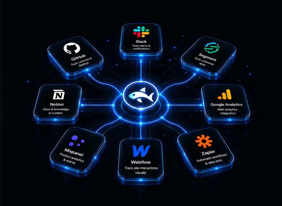
The tracker is the standard Vercel Analytics snippet pointed at Dory's own endpoint, so any Vercel-deployed app starts sending data by swapping one URL — pageviews, custom events and component-visibility views, all dual-written to MongoDB + ClickHouse with full CORS and OPTIONS handling. The bet underneath it all: the next generation of analytics isn't about more data to look at, it's about fewer decisions to make. The dashboard shows what happened, RCA shows why, decision intelligence shows what to do, and the webhook delivers it to where the team already works.